A UI facelift using the new design system for better look, usability, and responsiveness
Applied a design system facelift to older UIs, making thoughtful layout adjustments for smaller screens and leveraging advanced variants to ensure consistency and responsiveness.
Product Type
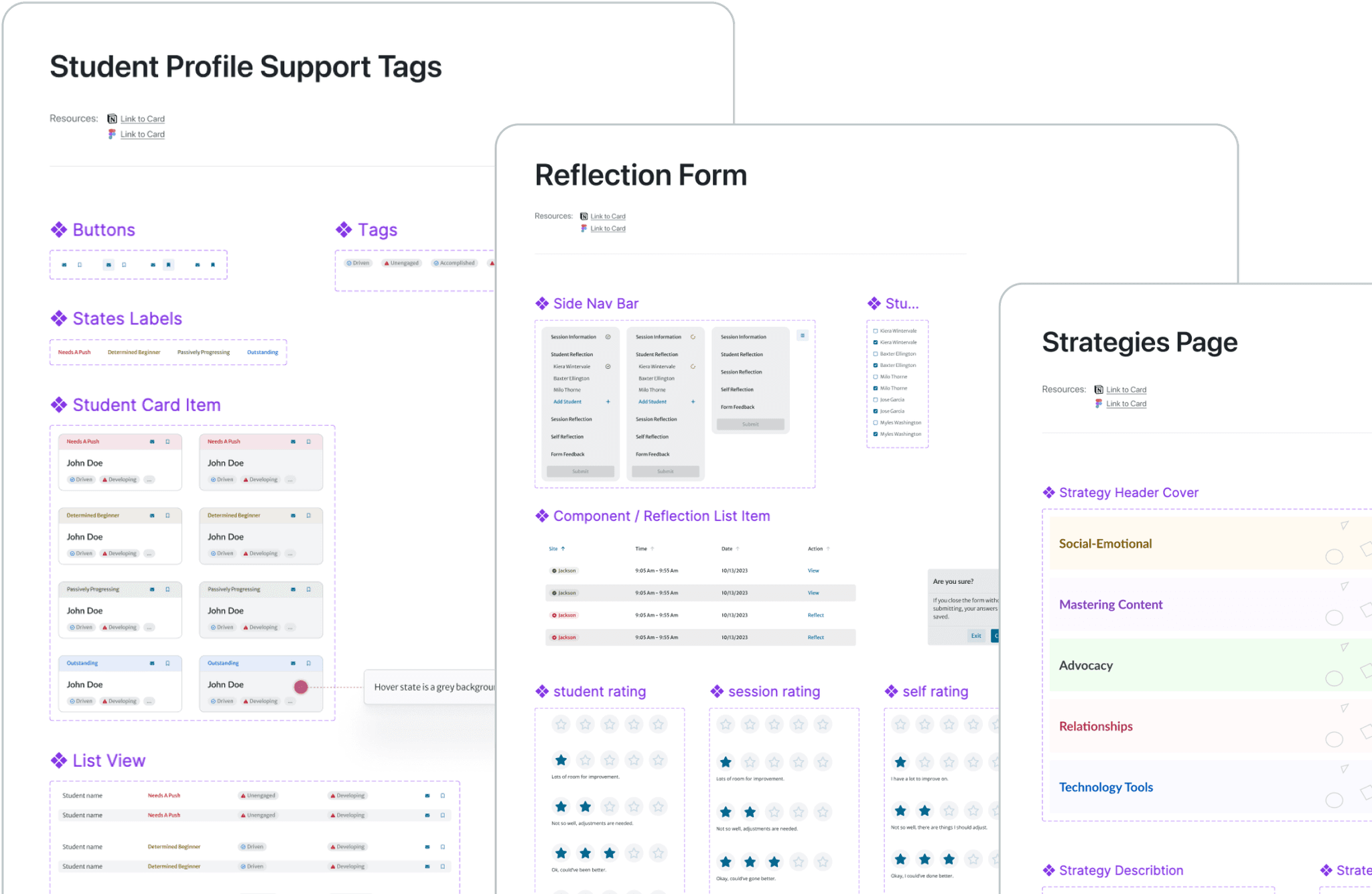
Design System
Duration
Sep 2024 (1 week)
Team
Bill Guo (Product Manager)
Responsibility
Design system, responsiveness, variants
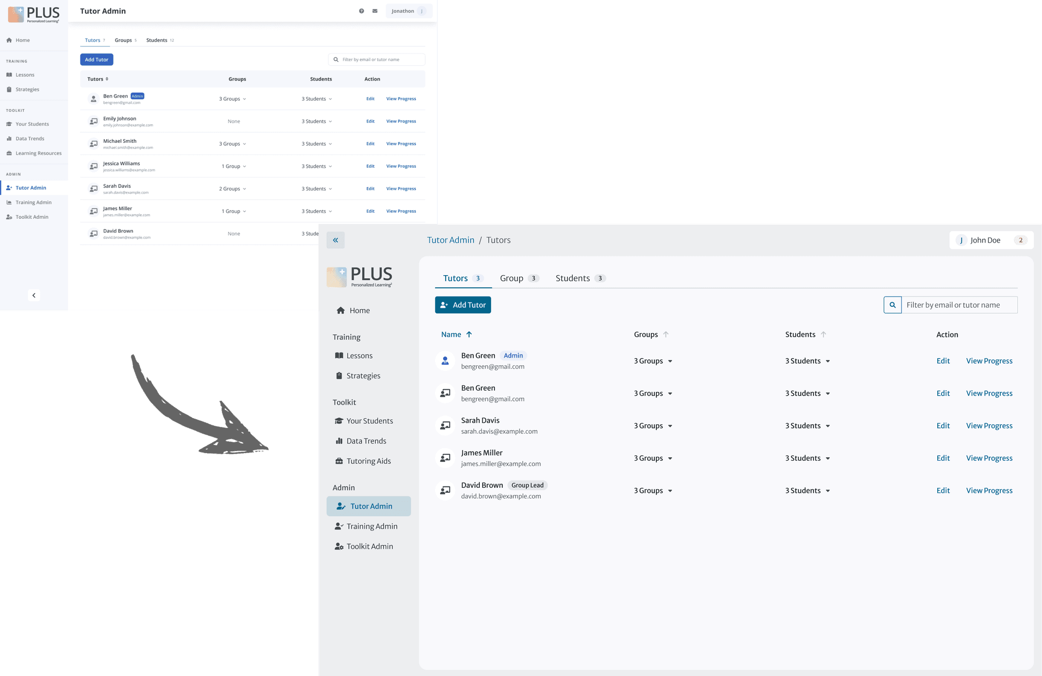

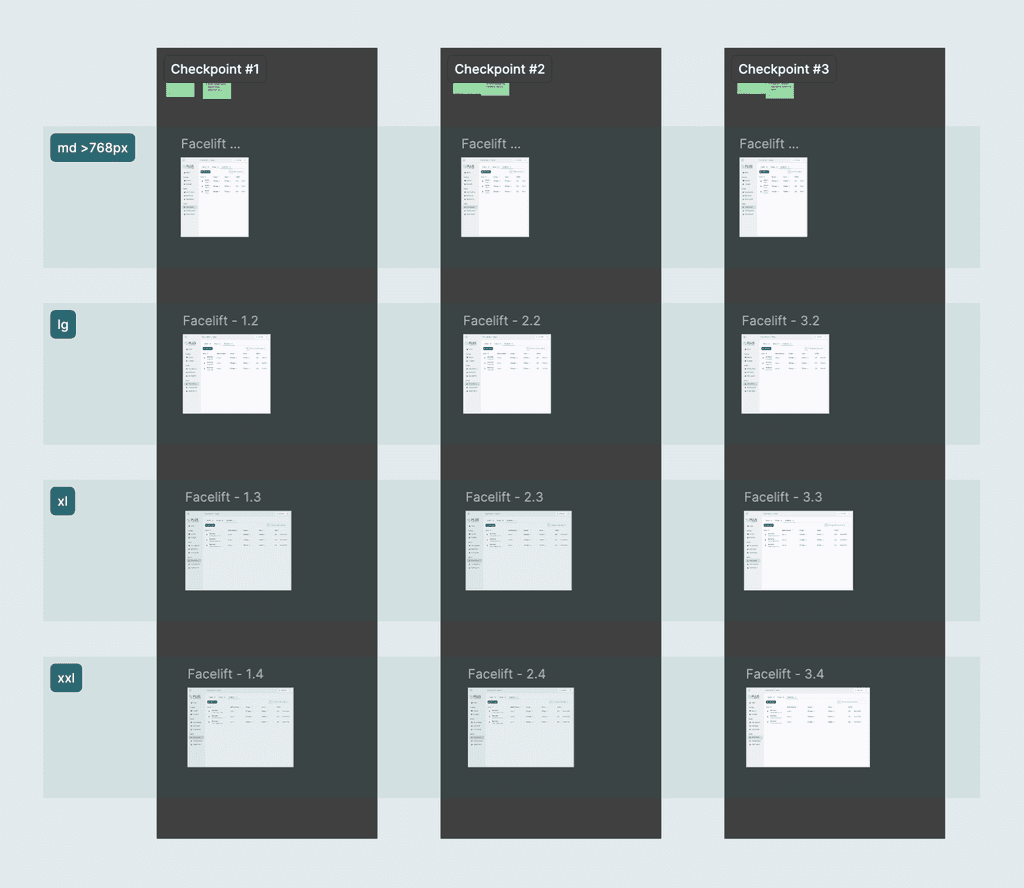
PLUS design system team revamped the entire design system and each designer was tasked with updating specific frames using the new system, ensuring responsiveness of each frame, and hand off to developers for implementation.
Firstly, I chose the correct components from the design system, adjusted their variables according to the documentation and the specific content of this page.

Then I ensured all the paddings between components are adjusted to the new design guidelines.
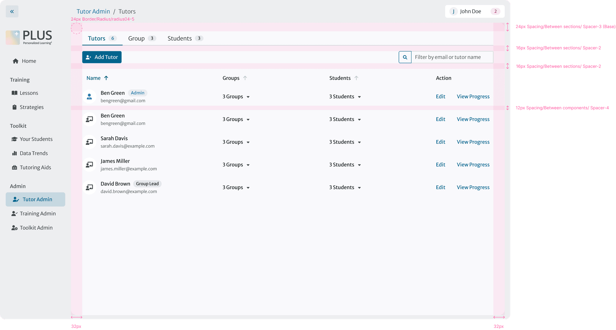
I followed the internal guidelines for responsive design, which is a 3-step checker than ensures all frames are adaptable across various screen sizes and breakpoints.
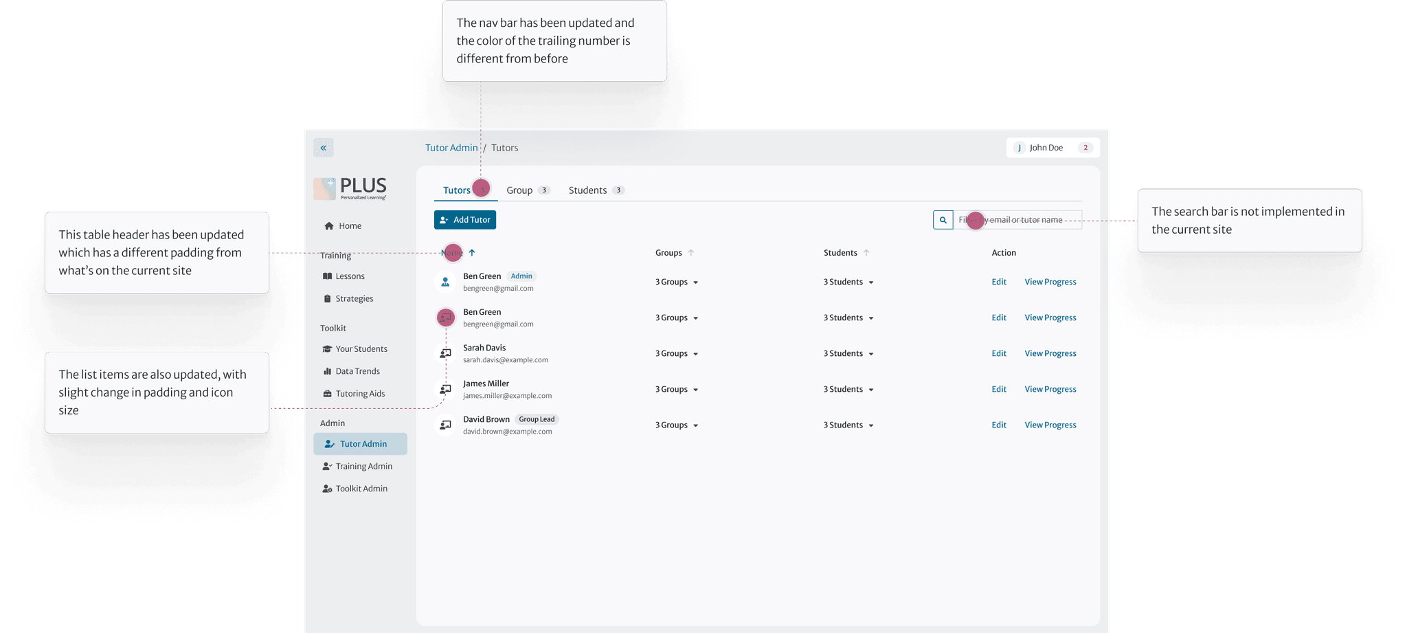
One challenge I faced was that some components in the design system weren’t optimized for smaller screens. To address this, I made strategic decisions to hide unimportant columns and implement horizontal scrolling when necessary.
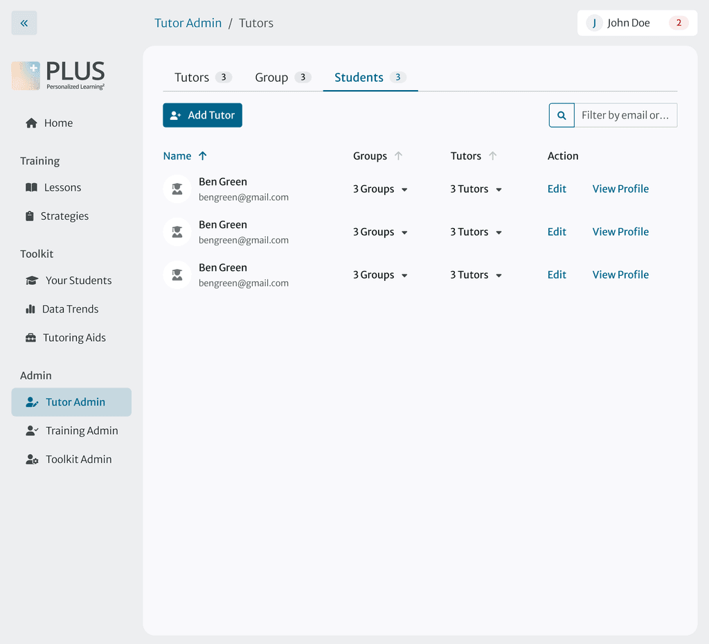

I wrote clear and concise notes for developer using our internal tooltip to point out where and what changes have been made.